Why Does My Site Rank Differently on my Computer and Mobile?

The way people use the internet has changed dramatically over the past decade. The proliferation of smartphones and other mobile devices led to a significant shift in the way we browse and search for information online.
This shift has not gone unnoticed by search engines as they’ve adapted the same to better reflect the changing behaviours and preferences of mobile users. As a result, the ranking factors for mobile and desktop devices are different to some extent.
With more people relying on smartphones and tablets for browsing the web, businesses need to understand the differences in ranking for mobile and desktop devices.
In this article, we’ll explore the differences between mobile search results and desktop search results and provide insights into how you can optimise your site for both device types. This will help you effectively reach your target audience and maximise your online visibility.
Additionally, we’ll cover topics such as the impact of page speed, user experience, and mobile-friendliness on your search rankings. Further, we’ll provide tips and best practices for optimising your website for mobile and desktops.
But first let’s get started by understanding the importance of Mobile SEO:
The Importance of Mobile SEO
Mobile SEO is the practice of optimising your website and online content for mobile devices. It has become increasingly important in recent years as more and more people use their smartphones and other mobile devices to browse the web.
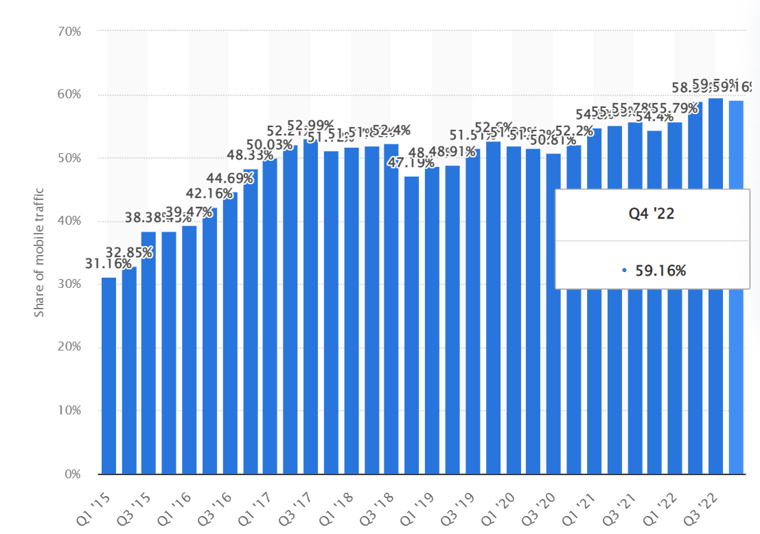
With around 60% of internet traffic coming from mobile devices, businesses need to focus on mobile optimisation in order to reach their target audience effectively.
Mobile optimisation is not just about making your website look good on small screens. It's also about improving the overall user experience, ensuring that your website is fast and responsive, and making sure that your content is accessible and readable on any device.
Mobile optimisation helps improve your mobile search rankings, increase your website's visibility, and drive more traffic and engagement. Additionally, it's also important to consider the context in which users are accessing your website.
Mobile users tend to have different needs and behaviours compared to desktop users, and it's essential to cater to these needs to provide an optimal experience. This can include designing content specifically for mobile, creating mobile-friendly forms and landing pages, and optimising for local search.
Overall, mobile SEO is a crucial component of any comprehensive digital marketing strategy. Thus, businesses need to prioritise it in order to reach and engage their target audience effectively with SEO optimisation in the mobile-first world.
Mobile SEO vs Desktop SEO: Optimisation Differences
Mobile SEO and Desktop SEO are two distinct branches of SEO that focus on optimising websites for mobile and computers, respectively.
Here’s the search result for mobile:

Here’s the search result for desktop:

As you can see, the search results for both device types vary greatly even when both devices are accessed from the same location and are connected to the same Wi-Fi network. Although the goals of both are the same, there are several key differences between mobile and desktop SEO.
One of the main differences between mobile search results and desktop search results is the importance of page speed. Mobile users are less patient than desktop users and are more likely to abandon a website if it takes too long to load.
Apart from page speed, on-page/off-page, and technical SEO, it also includes designing mobile-friendly navigation, using larger text and buttons, and ensuring that your content is easily accessible on all devices.
Indeed, mobile optimisation places a heavy emphasis on page speed and mobile friendliness. Since mobiles have smaller screens and different capabilities compared to desktops, mobile SEO must take the differences between them into account.
Google and other search engines now use mobile-friendliness as a ranking factor, and a website that is not optimised for mobile may get penalised in search rankings.
Mobile-First Indexing: What Is it & How It Impacts Your Ranking?
Mobile-first indexing is a new approach to indexing and ranking websites in search engine result pages (SERP) that prioritises the mobile version of a website over its desktop version.
In other words, search engines primarily use the mobile version of a website to determine its relevance and ranking in search, rather than its desktop version. The rise of mobile devices and smartphones to browse the web has led to the adoption of mobile-first indexing by Google.
By prioritising the mobile version of a website, Google aims to provide a better user experience and ensure that the most relevant and up-to-date content is displayed. Mobile-first indexing significantly impacts search rankings, visibility, and overall user experience.
It's essential to understand the impact of mobile-first indexing and to ensure that your website is optimised to rank on mobile as well as on desktop.
To prepare for mobile indexing, focus on improving the mobile-friendliness of your website, ensuring that it loads quickly and smoothly on any device. Further, optimise the content and structure of your mobile website to meet the needs of mobile users.
Overall, mobile-first indexing is a major shift in the way search engines index and rank websites on mobile and desktops. By focusing on mobile optimisation and providing a high-quality experience, businesses can ensure that their website is well-positioned for success in the mobile-first world.
5 Factors Responsible for Variations in Ranking on Mobile and Computer
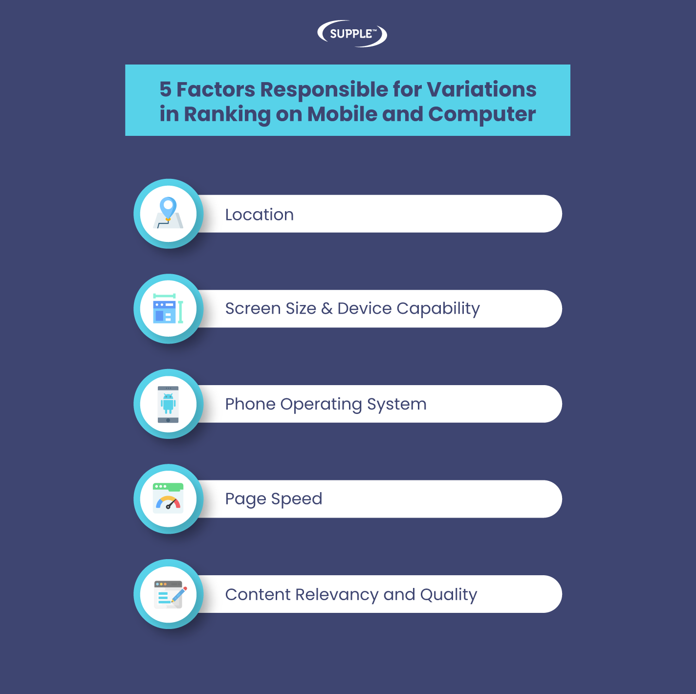
Now that we have understood the differences and mobile-first indexing to ranking on mobile and desktop, let’s get to know the top factors responsible for variations in mobile and desktop rankings:
Location
Location plays a significant role in determining the desktop and mobile search rankings of a website. Search engines use a user's location to provide relevant and local SEO results, which affects the visibility and ranking of different websites in SERP.
For mobile devices, location is even more important because mobile users are often on the go and searching for information that is relevant to their current location. Search engines take this into account and use GPS data to provide location-based results.
For example, if a user searches for "hotel or restaurants" on their mobile, search engines may display recommendations for hotels & accommodations in the user's current area.
For desktops, location can also play a vital role in search rankings, but it may not be as prominent as on mobiles. For example, search engines may use a user's IP address to determine their location to provide local results, but this may not be as accurate as mobile GPS data.
Screen Size & Device Capability
Screen size and device capabilities are also important factors to determine the ranking of a website on mobile and desktops. The size and capabilities of different devices can affect the way websites are displayed and the user experience they provide, which in turn can impact rankings.
For mobile devices, the small screen size and limited capabilities of some devices can make it more difficult to display and access certain elements such as images and text. This can affect the overall user experience and impact the rankings on mobile.
For desktops, the larger screen size and more advanced capabilities can provide a better user experience and potentially improve the desktop search rankings.
However, some desktops still have limited capabilities, such as lower screen resolutions or slower processing speeds, that can impact the way a website is displayed and its ranking.
Phone Operating System
The operating system of a mobile phone can impact the ranking of a website on mobile devices. Different operating systems, such as iOS and Android, use different browsers and have different screen sizes, resolutions, and capabilities, which can affect search rankings.
Search engines take these differences into account when determining the ranking of a website on mobile devices. For example, a website optimised for iOS devices may not be optimised for Android and vice versa. This can lead to differences in ranking for the same website on different operating systems.
Operating systems are not typically a factor in desktop search rankings, as most computers use similar browsers and have similar screen sizes and resolutions. However, differences in browser compatibility and display capabilities can still impact the way a website is displayed and the user experience it offers.
Page Speed
Page speed plays a crucial role in determining the ranking of a website on both mobile devices and desktop computers. You can analyse your website’s page speed using tools such as PageSpeed Insights, GTmetrics, and others.
Search engines consider page speed as an important factor in the user experience, and a slow-loading website can negatively impact a website's mobile ranking positions.
As mentioned, page speed is an important factor for many mobile users as they access the internet on slow or unreliable networks. A slow-loading website on a mobile device can cause frustration and lead to a high bounce rate, impacting the mobile search ranking.
Page speed is also an important factor for determining desktop search rankings, but not as prominent as for mobiles. Nevertheless, a slow-loading website on a desktop can still negatively impact the user experience and potentially lower the website's ranking on computers.
Content Relevancy and Quality
Lastly, content relevancy and quality are crucial for search engines to rank a website on both mobiles and computers. Search engines consider the relevancy and quality of a website's content when positioning a page in search results.
Content relevance and quality are particularly important for mobile devices. High-quality and relevant content optimised for mobile devices can provide a better user experience and improve the mobile search ranking of your website.
Similarly, content relevance and quality are also important factors in determining desktop search rankings. Creating high-quality content specifically for desktops would offer a better experience and rank higher which will differ from its mobile rankings.
There are several content creation services and tools available to help you come up with ideas for execution. For instance, you can use WordPress or Wix platforms for content marketing.
How to Check Your Website is Mobile and Desktop-Friendly
By following the below steps and using the small business tools, you can ensure that your website is mobile and desktop-friendly and is optimised to appear in search:
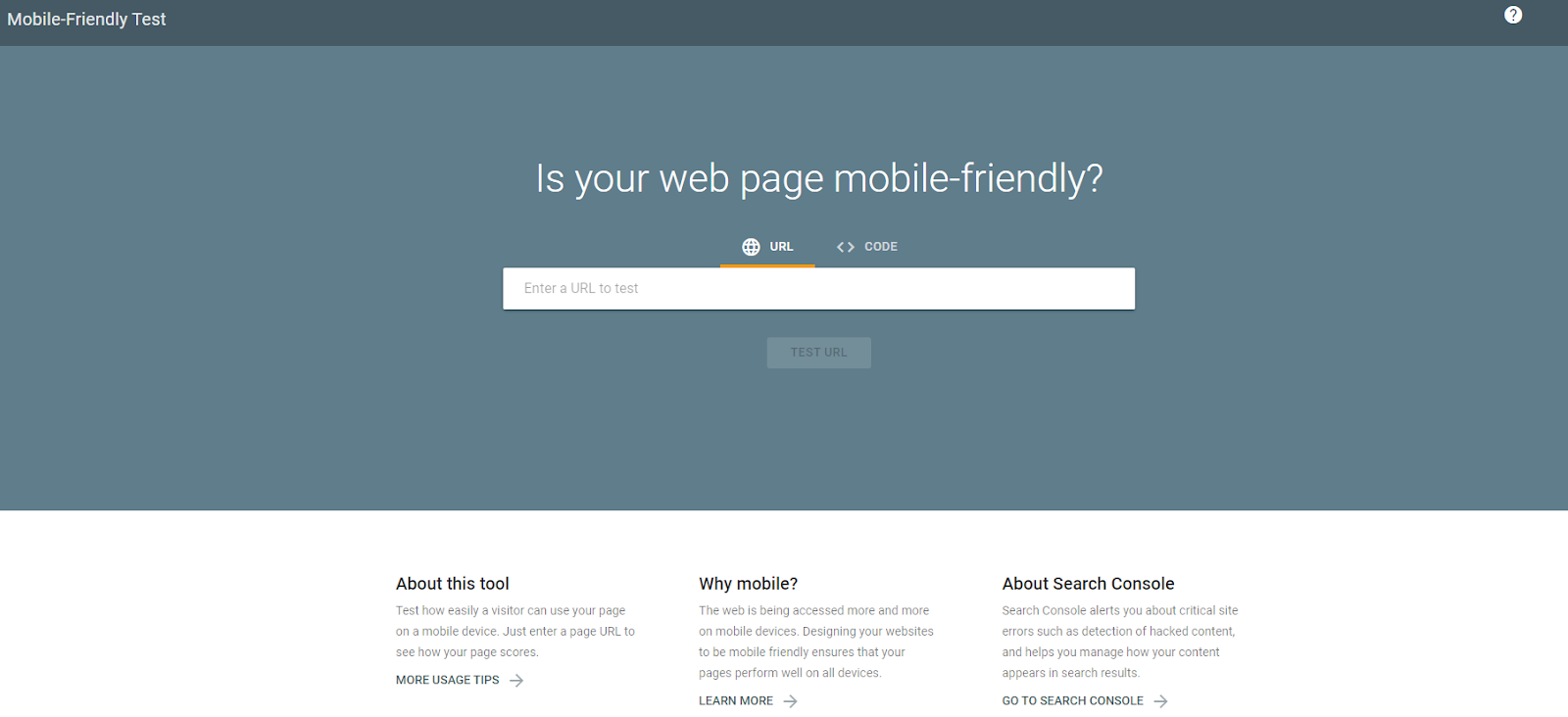
Use Google's Mobile-Friendly Test Tool: Google provides a free tool that allows you to test if your website is mobile-friendly. Simply enter your website's URL and the tool will provide a report on the mobile-friendliness of your site, including any issues that may be affecting your ranking in mobile search results.
Test Your Website on Different Devices and Browsers: To get a comprehensive understanding of your website's mobile and desktop-friendliness, it's important to test it on a variety of devices and browsers. This will help you identify any potential issues that may be affecting your ranking in Google SERP.
Check for Responsive Design: Responsive design is a critical component of ranking-friendliness. It allows your website to adjust to the size and orientation of different devices, providing an optimal viewing experience for users on any device. You can also use Google's Mobile-Friendly Test Tool to check if your website is using a responsive design.
Check for Load Times: As mentioned, page speed is a critical factor in determining the ranking of a website on both mobile and computers. Use tools like GTmetrix or PageSpeed Insights to check the load times of your website on different devices and browsers.
Evaluate Your Content: High-quality and relevant content is important for both mobile and desktop-friendliness. Make sure your website has content that is optimised for both mobile and desktop devices, including images, videos, and text.
Final Thoughts
Optimising a website for both mobile and desktop devices is critical for success in search rankings. Search engines consider a range of factors when evaluating the ranking of a website, including the device being used, screen size, page speed, content relevance and quality, and more.
By understanding the difference between mobile search results and desktop search results, businesses can ensure that their websites are optimised to rank for both. You can make sure that your site is optimised for all devices and browsers your audience is using, improving the visibility and ranking in search.
However, it's important to remember that the search ranking landscape is constantly evolving, and businesses may need the helping hands of an expert SEO agency like Supple. We help you stay up-to-date with the latest best practices for mobile and desktop optimisation.
Get in touch with our experts for regular monitoring of your website's performance and make updates as needed. Further, we’ll help you maintain a strong presence in search results and reach a larger audience of potential customers.

-
Hardy Desai
Hardy is the visionary founder of Supple Digital, a boutique SEO agency based in Melbourne, Australia. With a profound understanding of the digital landscape and a deep passion for innovation, Hardy has steered Supple Digital to become a leading name in the SEO domain.


DIGITAL MARKETING FOR ALL OF AUSTRALIA

- SEO AgencyMelbourne

- SEO AgencySydney

- SEO AgencyBrisbane

- SEO AgencyAdelaide

- SEO AgencyPerth

- SEO AgencyCanberra

- SEO AgencyHobart

- SEO AgencyDarwin

- SEO AgencyGold Coast

- We work with all businesses across Australia
