Is SEO different for Desktop and Mobile Sites?


So, you have already designed your website, implemented a strong SEO strategy and started gaining some traction on the SERPs. But you are seemingly losing out on important leads simply because your website is not exactly ranking well on mobile searches because there have been some SEO mistakes.
This is a worrisome situation. You may want to analyse your technical SEO and website performance to figure out the problem, but you should ensure that you deal with it effectively.
As a business owner, you need to capitalise on your website’s mobile performance just as much as its performance on desktops. After all, 59.16% of web traffic is driven by mobile device users.
In this article, we will compare the similarities and differences between Mobile SEO vs. Desktop SEO, and strategies that you can deploy to take advantage of these strategies.
Keep reading!
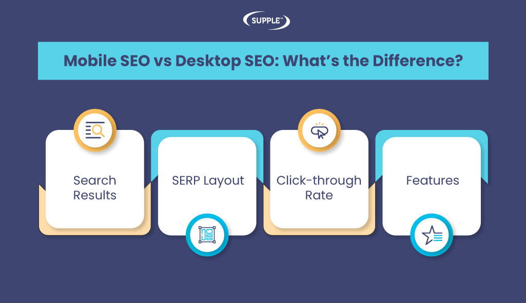
Mobile SEO vs Desktop SEO: What’s the Difference?
To unlock the fullest potential of your brand website, you will need to have a holistic SEO strategy and content strategy — combining the factors associated with its performance on mobile devices and desktops.
You may have rightly invested a lot of time and marketing budget into creating a desktop SEO campaign. With that, you are already well on your way to acing your mobile SEO performance, but you will need to consider a few additional aspects first.
So, let us look at the primary differences that should be considered in the debate of Mobile SEO vs. Desktop SEO.
Search Results
To a large extent, Google search results on mobile and desktop are not that different. Google optimises the results on the SERPs based on user expectations, which change depending on the device they are using. You will need to understand how your website performs on desktop searches and mobile searches so that you can tailor your SEO for mobile vs desktop.
The biggest difference between the two in this regard is in terms of how the results appear.
Mobile places emphasis on visuals which is why you will notice that the text search results on mobile devices are larger. The search results on mobile devices are designed to display as cards, with borders which tend to take up more space. This means that users will generally have to scroll a lot to get to the bottom of the search results.
Let us check this out with an example of the search query - “plumbers in sydney”. Here are the results displayed on a mobile search:
Even though these scrolls are short, the increased number of scrolls leads users to click on the first few search results.
On the other hand, users will find it easier to scroll through the results on the desktop. This is because most desktop screens can accommodate several search results at one time, unlike mobile screens that fit only one or a couple of results.
Take a look at how the search results for the above query when carried out on a desktop:
SERP Layout
Due to the differences in the dimensions of mobile devices and desktops, the SERP layout is very different in both devices. These differences are also pertinent to how users view your website.
Mobile devices have vertical screens and are much smaller in size compared to desktop screens. Plus, mobile search results get far less search real estate compared to desktops. Mobile search results can often take up more room as they often contain a picture.
It is also important to note the impact of SERP features on the search layout in mobile devices and desktops. We will discuss more on the difference between the SERP features for mobile and desktop searches in a bit.
Click-through Rate
Let’s now talk about an aspect that is very important and decisive for companies that invest extensively in boosting the SEO performance of your website.
How your website ranks on mobile search results or desktop search results can influence its SEO performance and users’ preference.
You may already know that the first few search results enjoy the highest CTR, which drops as you scroll down the results. The click-through rate for mobile devices drops significantly less than for desktop searches.
Take a look at the CTRs for organic search results on mobile and desktop devices, according to a study conducted by Advanced Web Ranking.
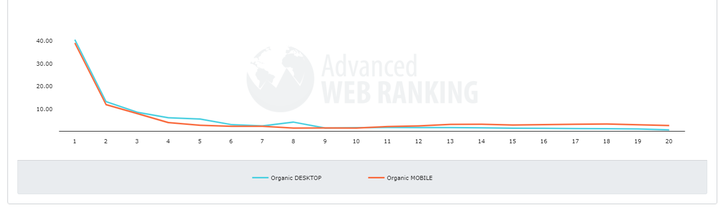
As you can see, even though the drops in CTR of desktop and mobile search results are pretty similar, the ones for mobile results are lesser than that for desktop. As discussed earlier, the drop in the CTR of the first few results is very similar to desktop and mobile devices.
When you compare the CTRs of the 12th or 13th organic search results, you will see that the ones for mobile devices (2.37%) are far higher than desktop devices (1.66%). The reason behind this is perhaps that users can open each card and access relevant details more easily.
On desktop, users can view around five results on a single screen so they are more likely to decide which specific result they want to click on and select one of the first ones.
Features
We did start talking a little bit about SERP features when we discussed SERP layouts, but let us now delve deeper into that.
Many of the SERP features are common between desktop and mobile search results. However, most of them are quite different. Firstly, mobile displays more features than desktop, and these features can often look different.
For example, Knowledge Panels appear at the top of the SERPs on mobile devices but are on the right on desktops.
Due to such placements of features, the results get pushed further down the page and can lead to users scrolling and swiping for a longer time.
Additionally, mobile has a few exclusive features, which do not show up on desktop search results. Interesting Finds is such a SERP feature that leverages Google algorithms to display web pages that Google thinks you might find interesting.
Almost every SERP feature that you see on Desktop search appears on mobile searches as well. Some of these features include People Also Ask, Local 3-Packs, Featured Snippets, Knowledge Panels and more.
Google’s Mobile-First Indexing Approach
Google’s Mobile-First Index has been around for a while now. Over the years, most websites have moved to the mobile-first index — crawling your website using smartphone Googlebot. It is important to note that Google has additionally placed a lot of emphasis on Page Experience making it a ranking factor, for mobile as well.
One of the biggest tenets of mobile-first indexing is that the website experience that you deliver on desktops should be similar to the one that you deliver on mobile devices. Some of the best practices for mobile-first indexing include a list of recommendations that Google has time and again placed a lot of emphasis on.
Here are some considerations that you should definitely keep in mind:
- You should have an equal number of desktop pages and mobile pages
- You should verify your mobile and desktop websites on Google Search Console
- You must ensure that your mobile site can handle an increased crawl rate
- You must avoid fragmented URLs on mobile websites
- You must verify that the error page status on mobile and desktop websites are the same
You will need to conduct regular SEO audits on your website so that you can update and get it up to speed with the mobile-first indexing approach.
Top Mobile SEO vs Desktop SEO Strategies
Now that you have understood the subtle differences between mobile SEO and desktop SEO, it is time to get to the actionable part. We have listed some of the top Mobile SEO and Desktop SEO strategies that you should consider when you want to take your website to the next level.
Optimise for Local SEO
Local SEO is important for any business that wants to perform well on the SERPs. When you optimise well and rank for local search queries, you will also be able to empower your SEO for mobile vs desktop.
When you rank for local keywords, you will be able to gain visibility on the mobile and desktop search results. So, if you have not yet started optimising your website for local SEO, you should start right away.
Utilise keywords that demonstrate a local search intent. Additionally, you should also create and optimise your Google Business Profile.
Create a User-Friendly Design
Regardless of the device on which the users are going to access your website, you will need to ensure that it is user-friendly. Today, having a responsive design for your website is not optional, considering you have to keep user experience on top of your priority list.
A responsive design ensures that your website can adjust to any device size, so you can deliver a consistent user experience regardless of whether your users visit it on a tablet, desktop or their mobile device.
Not to forget, mobile responsiveness can help your website rank better, so you get to please your users and Google gods at the same time.
Conduct Effective Keyword Research
If your business is looking to maximise the role of your website in bringing new business, you absolutely need to consider how effectively you are leveraging keyword research. To ensure that your keywords are primed to ensure your website’s mobile friendliness, you need to start thinking like your potential customers would when they are searching for something on their mobile phones.
For instance, including keywords that have a location in them, such as “flooring solution in hobart” would raise the odds of your website showing up on the search results when a user searches for a flooring company in the location.
You will also need to pay attention to the different kinds of contexts in which your users might need the product or service that you are offering. Lastly, you should specifically include long-tail keywords and terms since a lot of users verbally search for their queries through Voice Search, as a result of smartphone developments.
Design a Fast-Loading Website
One of the biggest reasons why a user might just search for a query on mobile phones instead of waiting to get on a desktop is that they want an immediate answer. If your website is unable to deliver this, managing to make your website rank on mobile searches will not be enough.
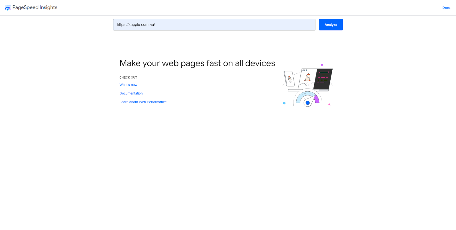
You can use PageSpeedInsights to analyse the speed at which your website and web pages load. Simply enter the URL of the page you want to measure speed for and you will get a detailed report on its performance in terms of Core Web Vitals.
Even a second’s delay in your website loading can reduce your customer satisfaction by 16%. This means that you will need to constantly ensure that your website is loading fast and meeting your users’ expectations.
If you are using a CMS like WordPress or Shopify, you can also purchase or install plugins that can help you increase and constantly improve your website speed. Moreover, check your website speed using website speed tools so that you can optimise it effectively.
Have Mobile-Friendly Content
Content plays an important role in ensuring that your website performs well on the SERPs, and enthrals your customers. There are some prerequisites for any kind of content that you post on your website such as ensuring E-A-T and including relevant keywords.
Furthermore, to ensure that your content is mobile-friendly, you will need to optimise your web pages and make them consistent. You must also double-check that the text and icons on your web page are not too small or large.
To test whether your website is mobile-friendly, you can use Google’s Mobile-Friendly Tool and find out the areas of improvement and related solutions.
Concluding Remarks
Now that you know how important it is to balance your mobile SEO and desktop SEO, it is time to get to work. With the mobile-first indexing approach, your website must be equally responsive on mobile devices and desktops.
Keep in mind the strategies that we have listed in this article, and if you find yourself needing help, do not hesitate to seek help from a reputed SEO agency.

-
Hardy Desai
Hardy is the visionary founder of Supple Digital, a boutique SEO agency based in Melbourne, Australia. With a profound understanding of the digital landscape and a deep passion for innovation, Hardy has steered Supple Digital to become a leading name in the SEO domain.


DIGITAL MARKETING FOR ALL OF AUSTRALIA

- SEO AgencyMelbourne

- SEO AgencySydney

- SEO AgencyBrisbane

- SEO AgencyAdelaide

- SEO AgencyPerth

- SEO AgencyCanberra

- SEO AgencyHobart

- SEO AgencyDarwin

- SEO AgencyGold Coast

- We work with all businesses across Australia
